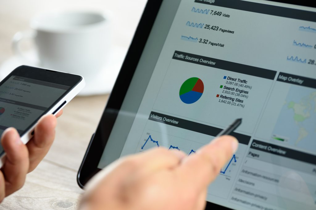

E-commerce ideas for your online store
Beauty, style, and temptation. Looking for ideas that look great online and boost conversions too? We never sit still and always keep a close eye on what’s happening in e-commerce, so some of these points feel obvious to us. But are they obvious to everyone? Does your online store meet today’s visual standards? What do shoppers expect from an online store now, and how do you help them find the right product? That’s why we’ve put our “obvious” ideas together in this blog post.
First impressions
The first impression has to be right, and it has to match what the shopper is looking for. That’s why we map out several customer scenarios and always start by asking: “Why does this online store appeal to me?” Those factors are central to the store, so nothing should get in their way. Examples include:
- Reliability
- Fast & free delivery
- The right products
- Store speed
- Ease of use
- Value for money
Calm, clean, and consistent
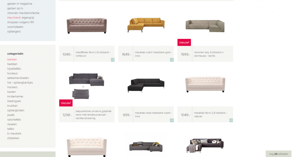
Once you know what your users are looking for, designing your online store gets a lot easier. Take the product overview, for example. Is everything clearly visible? Are the images easy to see? Is there enough space between items? Are you making good use of the screen? In short: space, structure, and repetition. (Calm, clean, and consistent.)
Calm, clean, and consistent
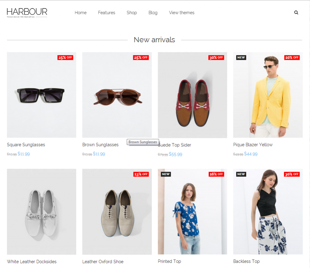
Now you have a clean product overview: plenty of space between the images, clear sections, and a logical structure. But what if you want to give users more information, like a label or an eye-catching price? How do you handle the image and the hover effect? What information do you show, and do you even need a hover effect? If you do use one, make sure it adds more visual appeal.
I spy with my little eye
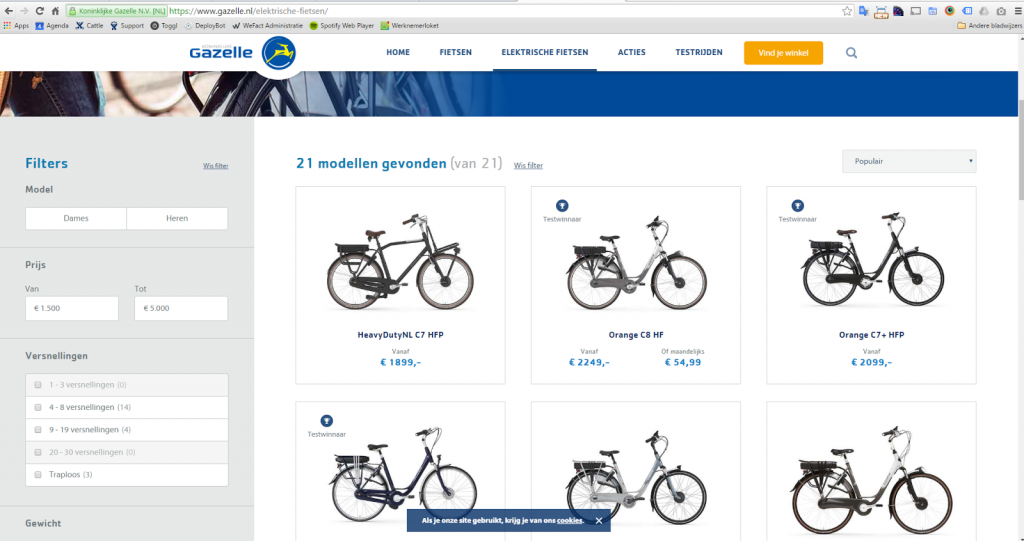
Great! You’ve got a clean overview that takes all the points above into account. Now your visitor is ready to pick a product from the 383 in this category. Tough choice. Help them out with good filters that update the results quickly. How fast filters respond matters just as much as which filters you choose. On an overview page, a filter may matter even more than a menu, so give it a prominent spot that stays in view as users scroll. So filter your results within each category. And show how many products are left.
Wait, what was I doing again?
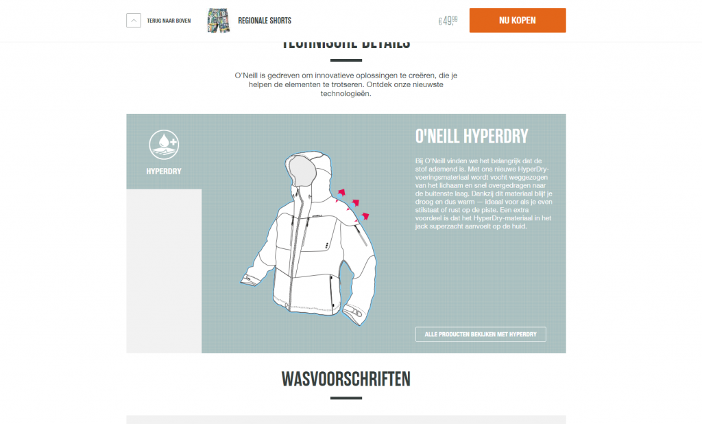
Users also appreciate a menu that stays visible while they scroll or browse the store. But a menu bar is often packed with options they don’t need at that moment. So what if you tailored the navigation to what people actually need while they’re navigating or scrolling? The O’Neill online store is a great example. Its menu adapts to what the visitor is doing:
Mobile
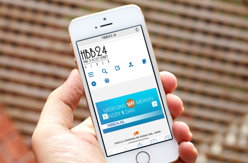
More and more searching, browsing, and buying happens on mobile (in many cases, 30% of visitors). Make sure your website is ready for it. Start with mobile and build up to the desktop version! Treat mobile as its own experience, showing only the essential information and keeping it easy to use. Responsive design keeps your website scalable and delivers the best user experience on every device.
Ding dong!
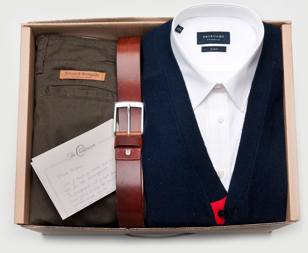
The order is placed and on its way. But how is it being shipped? Have you given the packaging any thought? What will it feel like to unpack the order? Hopefully, like a little celebration. So make sure customers have a great experience the moment they open the package. A “personal” thank-you is always a nice touch, too.
Let stories support your products
Oh, and beyond the user experience tips above, there are countless SEO opportunities connected to your products. Think content creation. After all, you’re bound to have something to say! New content brings in more visitors from new sources. Consider a blog of your own, filled with stories that support your products. Video, along with the channels to share it, is another great way to draw people in. Ever heard of Schema.org? Also pay attention to the SEO markup on your pages. Didn’t think about it when building the store? There are modules for that. Markup for Google really does matter. Displaying product reviews is a good example. That’s visual appeal too:

Honestly, this list could go on and on. I haven’t even covered the menu, images for your Google Shopping feed, or using PHP7 or Magento 2. As mentioned, the examples above all focus on winning over your visitors. Is there room in your online store for a bit more visual appeal? Get in touch and let’s talk through some ideas.